MND Association has rebranded with a new look, logo and use of imagery, amid concerns its old identity was “holding us back”.
The motor neurone disease charity says a consultation involving more than 5,500 people affected by MND, supporters, volunteers and the wider public revealed that its old brand was “like diving with the handbrake on”.
“To reach our goals – finding life-changing treatments through research, giving everyone with MND choice and control, and influencing positive change – we need a brand that matches our ambition,” it said.
The rebrand includes a fresh red colour brand and an image of a fingerprint, to reflect “the individuality of every person’s experience of MND”.
This is the first rebrand for the charity in a decade “and so much has changed in that time – the expectations of people with MND, awareness of the disease and the challenges people face, and the landscape we work in”, said the charity’s chief executive Tanya Curry.
She added: “While there'll be lots of talk about a new logo and a new colour, this is about much more than that – it's about us being bolder and more ambitious, striving harder and faster to improve the lives of people diagnosed with this brutal disease now and into the future.”


Latest News
-
Animal Welfare charity confirms cost cutting measures despite Dame Judi Dench intervention
-
Funder hands 20 charities £6.5m to tackle social injustice and inequality
-
Monday movers – 20 July 2026
-
Most popular good causes to support revealed
-
Probes launch into charities linked to ice rink chain
-
Friday funding round up – 17 July

Charity Times video Q&A: In conversation with Hilda Hayo, CEO of Dementia UK
Charity Times editor, Lauren Weymouth, is joined by Dementia UK CEO, Hilda Hayo to discuss why the charity receives such high workplace satisfaction results, what a positive working culture looks like and the importance of lived experience among staff. The pair talk about challenges facing the charity, the impact felt by the pandemic and how it's striving to overcome obstacles and continue to be a highly impactful organisation for anybody affected by dementia.
Charity Times Awards 2023
Mitigating risk and reducing claims
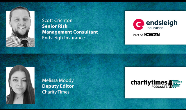
The cost-of-living crisis is impacting charities in a number of ways, including the risks they take. Endsleigh Insurance’s* senior risk management consultant Scott Crichton joins Charity Times to discuss the ramifications of prioritising certain types of risk over others, the financial implications risk can have if not managed properly, and tips for charities to help manage those risks.
* Coming soon… Howden, the new name for Endsleigh.
* Coming soon… Howden, the new name for Endsleigh.


© 2021 Perspective Publishing Privacy & Cookies
Recent Stories