Dogs Trust has rebranded to better appeal to a digital audience.
This is the first brand update for the dog rehoming and rescue charity for six years and has been created with agency The Clearing.
The “bigger, bolder brand expression” has been designed so it can ‘work harder across all channels, particularly digital platforms”, said the charity.
The existing circular logo remains but has been enhanced “with a stronger sense of movement”, it added.
The rebranding has also seen the colour palette refreshed, with warm yellow and brown tones, inspired by the blonde, biscuit and Red Setter colours of dogs.
In addition, brand photography “has been reimagined through a dog’s eye view” to show “imagery that captures the everyday bond between dogs and people”, added the charity.
The charity’s mascot Homer, which features on its circular logo, remains through the rebrand, but is joined by a “wider case of characters”, created by illustrator Mr Griff.
"Working with The Clearing to refresh the brand gave us the tools to tell that story more clearly and more powerfully," said the charity’s chief marketing and communications officer Jayne Whitton.
“Dogs Trust now has a warmer, more emotional identity that reflects the joy, playfulness and personality of the world of dogs.”
The Clearing’s Design Director Martin Willetts added; “The brief to help them become bigger and bolder has allowed us to add more movement, warmth and personality to the brand which will help them build a larger community of dog lovers.
“Dogs Trust was already a well-established charity in the UK. By introducing more movement, warmth and personality, the brand can help Dogs Trust build a bigger community and inspire more donations to fund the charity’s vital work.”


Latest News
-
Animal Welfare charity confirms cost cutting measures despite Dame Judi Dench intervention
-
Funder hands 20 charities £6.5m to tackle social injustice and inequality
-
Monday movers – 20 July 2026
-
Most popular good causes to support revealed
-
Probes launch into charities linked to ice rink chain
-
Friday funding round up – 17 July


Charity Times video Q&A: In conversation with Hilda Hayo, CEO of Dementia UK
Charity Times editor, Lauren Weymouth, is joined by Dementia UK CEO, Hilda Hayo to discuss why the charity receives such high workplace satisfaction results, what a positive working culture looks like and the importance of lived experience among staff. The pair talk about challenges facing the charity, the impact felt by the pandemic and how it's striving to overcome obstacles and continue to be a highly impactful organisation for anybody affected by dementia.
Charity Times Awards 2023
Mitigating risk and reducing claims
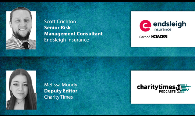
The cost-of-living crisis is impacting charities in a number of ways, including the risks they take. Endsleigh Insurance’s* senior risk management consultant Scott Crichton joins Charity Times to discuss the ramifications of prioritising certain types of risk over others, the financial implications risk can have if not managed properly, and tips for charities to help manage those risks.
* Coming soon… Howden, the new name for Endsleigh.
* Coming soon… Howden, the new name for Endsleigh.


© 2021 Perspective Publishing Privacy & Cookies
Recent Stories