Card Factory’s foundation has launched a rebrand to raise the profile of its support for communities, charities and individuals.
The new visual identity will be used across its funding programmes “under a cohesive and recognisable brand system”, says the grant maker. This includes its Life Moment, Local Community, and Match funds.
It will also be used across all formats, including digital, social media, internal communications and public campaigns.
In addition, its website has been refreshed to improve navigation for charities around funding opportunities.
The foundation’s new image is inspired by the retailer’s logo, including its font and structure, but with a different colour palette and graphic style.
Colours used “reflect the Foundation’s values of care, community and fairness” it says, through three figures to symbolise support, empath and togetherness.
“This rebrand and repositioning mark an exciting new chapter for the Card Factory Foundation,” said the foundation’s head Pushpinder Gill.
Earlier this year the foundation launched a £1.5m three year partnership with young homelessness charity Centrepoint. It is the sole founder of the Bright Future Initiative, which offers support to young people facing homelessness including therapy.


Latest News
-
Animal Welfare charity confirms cost cutting measures despite Dame Judi Dench intervention
-
Funder hands 20 charities £6.5m to tackle social injustice and inequality
-
Monday movers – 20 July 2026
-
Most popular good causes to support revealed
-
Probes launch into charities linked to ice rink chain
-
Friday funding round up – 17 July


Charity Times video Q&A: In conversation with Hilda Hayo, CEO of Dementia UK
Charity Times editor, Lauren Weymouth, is joined by Dementia UK CEO, Hilda Hayo to discuss why the charity receives such high workplace satisfaction results, what a positive working culture looks like and the importance of lived experience among staff. The pair talk about challenges facing the charity, the impact felt by the pandemic and how it's striving to overcome obstacles and continue to be a highly impactful organisation for anybody affected by dementia.
Charity Times Awards 2023
Mitigating risk and reducing claims
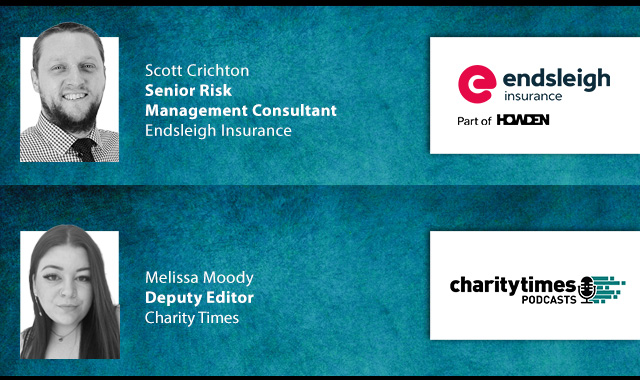
The cost-of-living crisis is impacting charities in a number of ways, including the risks they take. Endsleigh Insurance’s* senior risk management consultant Scott Crichton joins Charity Times to discuss the ramifications of prioritising certain types of risk over others, the financial implications risk can have if not managed properly, and tips for charities to help manage those risks.
* Coming soon… Howden, the new name for Endsleigh.
* Coming soon… Howden, the new name for Endsleigh.


© 2021 Perspective Publishing Privacy & Cookies
Recent Stories