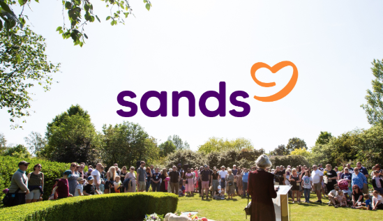
Baby loss charity Sands has unveiled its first brand refresh in a decade to create “a tone of voice that feels more like a conversation than a campaign”.
The still birth and neonatal death charity has updated its branding to create a visual identity “that’s brighter, more modern and inclusive, coupled with a new “simple and warm” logo that has tested well among long time supporters and new audiences.
It is hoped the brand refresh will help the charity reach more people who need support following the loss of a baby and make its messaging clearer.
The new logo sees a speech bubble, shaped in a heart and with a subtle reference to an infant shape, emerge from the charity’s name.
The brand refresh follows 18 months of consultations and work with branding experts. As part of this process, it received 10,000 pieces of feedback and the charity was supported by consultancy The Team.
“Right from the start, we knew this wasn’t just about design or logos,” said the charity’s director of income and engagement Daniel Brett-Schneider.
“It was about reflecting who we are as a community and doing that in a way that truly lives our values: being person-centred and evidence led.
“That’s guided us at every step, from the earliest conversations and research, all the way through to today as we begin to share the renewed and strengthened Sands brand with the world.
“It’s been more than a decade since we made any major changes to the brand, and in that time, a lot has changed - in the wider world and at Sands.”
Sands Trustee Sarah Threadgould added: “As a bereaved parent, a Sands trustee, and a communications professional, I’ve been deeply impressed and reassured by the care and rigour taken throughout this project.
“What’s emerged is a brand that not only reflects the compassion and warmth that have always defined us, but also gives us a clearer, stronger voice to drive change.”


Latest News
-
Burnham urged to translate mayoral charity sector commitment to national stage
-
Charity leaders handed peerages by departing Starmer
-
Charities welcome Burnham's first pledge as PM to end rough sleeping
-
Animal Welfare charity confirms cost cutting measures despite Dame Judi Dench intervention
-
Funder hands 20 charities £6.5m to tackle social injustice and inequality
-
Monday movers – 20 July 2026


Charity Times video Q&A: In conversation with Hilda Hayo, CEO of Dementia UK
Charity Times editor, Lauren Weymouth, is joined by Dementia UK CEO, Hilda Hayo to discuss why the charity receives such high workplace satisfaction results, what a positive working culture looks like and the importance of lived experience among staff. The pair talk about challenges facing the charity, the impact felt by the pandemic and how it's striving to overcome obstacles and continue to be a highly impactful organisation for anybody affected by dementia.
Charity Times Awards 2023
Mitigating risk and reducing claims
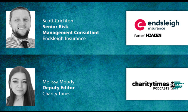
The cost-of-living crisis is impacting charities in a number of ways, including the risks they take. Endsleigh Insurance’s* senior risk management consultant Scott Crichton joins Charity Times to discuss the ramifications of prioritising certain types of risk over others, the financial implications risk can have if not managed properly, and tips for charities to help manage those risks.
* Coming soon… Howden, the new name for Endsleigh.
* Coming soon… Howden, the new name for Endsleigh.


© 2021 Perspective Publishing Privacy & Cookies
Recent Stories