The Haemophilia Society (THS) has unveiled a rebrand, 50 years since its launch.
The new red colours for the charity have been adopted across its website, design and logo “to create a contemporary and welcoming feel”, said the charity.
It added: “This step was necessary because as part of our aim to strengthen relationships with our members, and also our wider community.”
The rebrand follows a six-month consultation among members and testing of ideas with stakeholders and wider audiences.
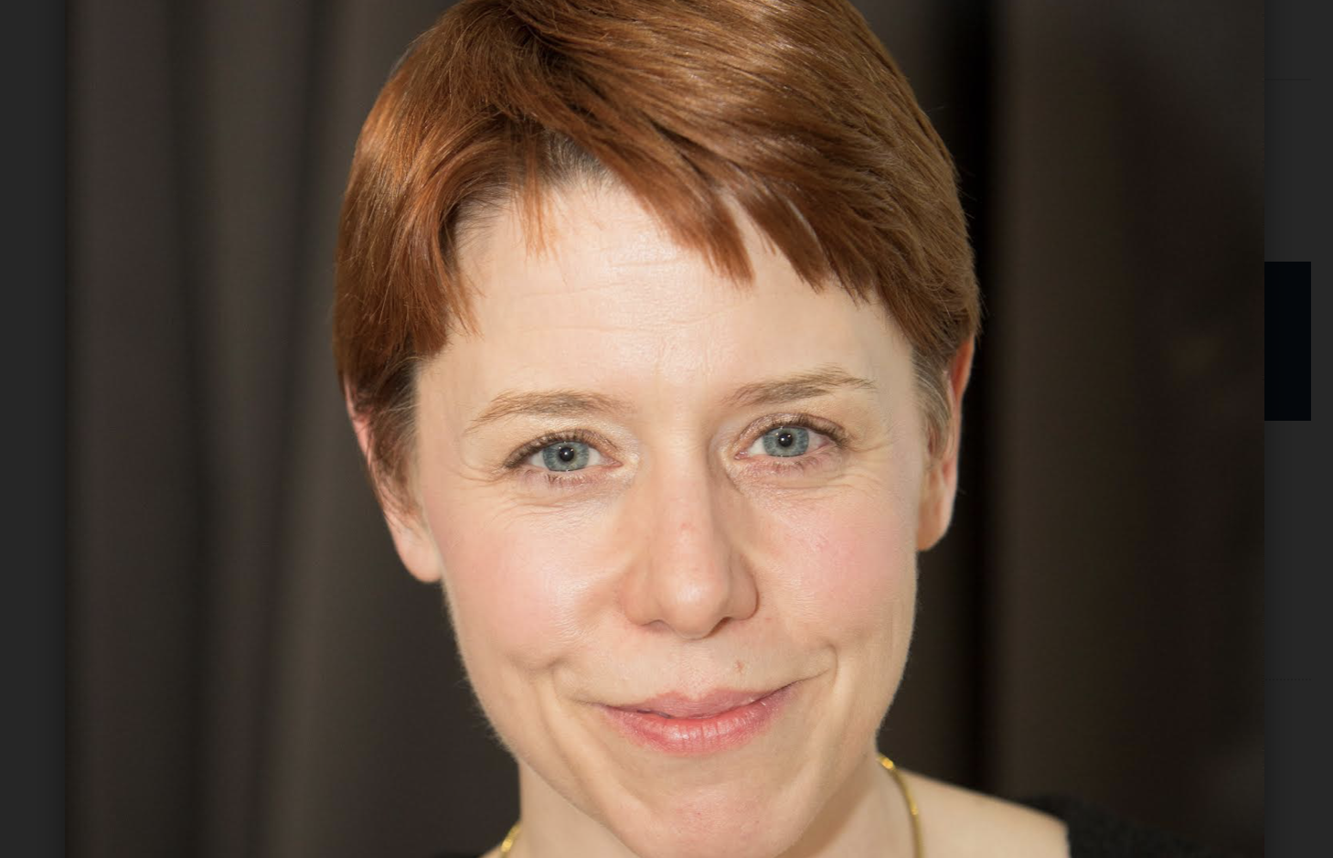
Haemophilia Society chief executive Kate Burt said: “Redeveloping our brand gives us a really exciting opportunity to build the profile of our charity.
“We want, and need, to bring more supporters onside. This includes reaching out to more people affected by bleeding disorders, as well as potential sponsors and donors.
“We are confident that this new look will allow THS to survive and thrive, and ultimately, support and empower even more people to live well.”
The rebrand is taking place in stages, starting with its website and social media and rolled out into other materials and projects. All new campaigns and design materials will feature the new branding.

Latest News
-
Fundraising Regulator hikes fees by up to 50% over next two years
-
Refugee charity promotes head of operations to CEO
-
More than a quarter of charities Europe wide are shedding jobs
-
Charity leaders urged to sign up to year long anti-racism programme
-
Charity Commission chair defends charitable think tanks
-
Charity leaders failing to prioritise cyber security, government report warns


Charity Times Awards 2023
Banking & charities: what's causing the rift & can we fix it?

The strained and deteriorating relationship between banking/finance and nonprofits has been well documented by the charity sector, so what does banking/finance have to say in response? Why isn't the relationship improving and how can it be fixed? With 30+ years of collective experience through working in international payments, IPT Africa's CEO Mark O'Sullivan and COO Daniel Goodwin give their insider's view
Better Society


© 2021 Perspective Publishing Privacy & Cookies
Recent Stories